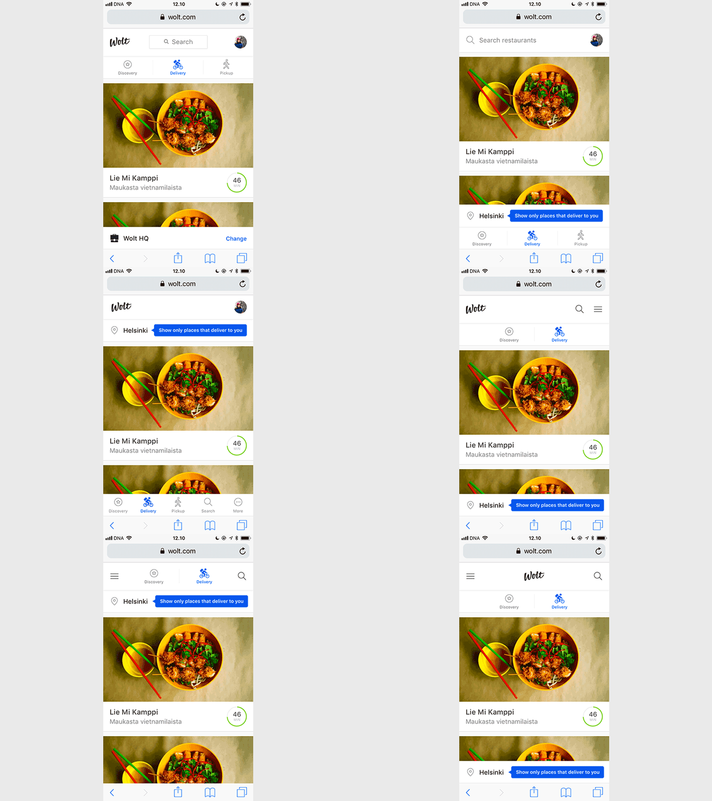
Mobile web header navigation explorations
Exploring different options for mobile web navigation. Because it's fun. But not only fun, it's also irritating because of those nice little space-consuming browser bars (or bar if talking about Chrome) AND because on the web we don't automatically know the location of the user unlike on mobile (if they haven't logged in with a saved delivery location) AND because all restaurants have slightly different delivery ranges AND because on mobile it would be more convenient to put main actions on the bottom for better thumb reachability (but on desktop they are usually on the top part of the view) AND because Pocari Sweat stash is empty AND a ton of other nice little reasons. Details, yeah!
More by Wolt View profile
Like
