Browsing Mobile Collection


Hey everyone! Hope you're having a good week!
Long text coming up here so hold on to something!
I've been thinking deeply lately when it comes to product design and experiences. How much of the work and solutions we create should be just for fun? How much should be absolute seriousness? How much should we question the logic, structures, and details of things and how much should we just enjoy the surface of it, give it a like, leave a comment saying "Awesome!" without thinking too much about it? I'm realizing that I analyze creations mostly from their executions rather than their intentions. To me, chaos is simply: Having inconsistent dimensions, unbalanced margins, too tight paddings, insufficient text sizes, inaccessible colors, and poor logic everywhere and nowhere.
Every day I'm noticing trending designs and solutions that simply lack finesse. How come? Why doesn't it take extreme caution and effort to get extraordinary cheers? Are we too busy to think things through, or am I thinking too much about it? You can't put things in the way of the iPhone X home indicator. We all should know that by now. You need to accommodate touch areas of your elements. This is nothing new. It's not practical to have text sizes way under guideline principals. If I can't even see the texts, how am I suppose to use your product? Alignments are crucial for your structures. How would architectures become if you ignored building foundations? Your designs may be totally useless if you haven't thought about these things, even though they might look pretty and gives you all the social recognition in the world
I strive to stick to systemized thinking, consistent treatments, logical interactions, visually appealing styles along with innovative solutions of things to work, all this as long as the core is never forgotten - feasibility. Is it really fair to keep creating things that aren't correct and influence upcoming designers to follow patterns that aren't thought through? I'm having difficulties to let these reflections go because this is really something I can't wrap my head around. This is also affecting me personally in a big way. How can I maintain the striving to achieve better solutions and more intelligent experiences when it doesn't feel like we are all in this together?
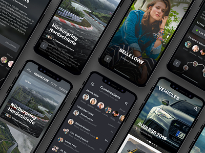
What is even this shot about? A set of 8 phone mockups angled 40 degrees with a drop shadow for no reason and screens in each that doesn't really show a connected flow? It's all quite unclear, but still, that's often all we need to do for design fame and not many will ever judge what you really created.
What are your thoughts on all this? I would enjoy having a conversation about what role designs, user experiences and thoughtfulness play in the bigger picture of our industry.
