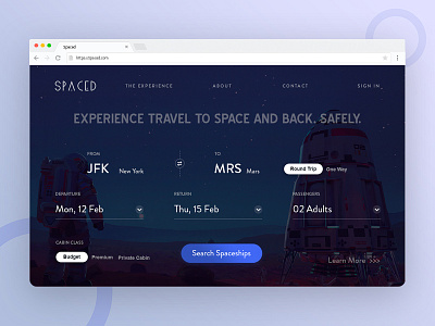
Homepage UI for SPACED
A take on the website UI for SPACED. As usual, the focus is on the booking experience. Scrolling down reveals other feature of the website. Hope you guys like it. Cheers!
More by Manajit Pal View profile
Like

