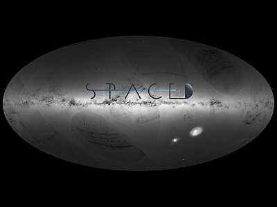
SPACED Logo on Gaia Picture #SPACEDchallenge

SPACED logo DESCRIPTION
To design this logo I started from an App Icon, where the focus of the narrative is the travel to new mysterious worlds as a new exciting experience. Everything happens safely and quick as suggested by the colored line, which as a straight trajectory passes through the letters. Professionalism in the Tech business are communicated by the color palette, with a small accent of vivid color to keep the brand fresh and oriented to a young audience (25-45y.o.), yet its solid structure portrays reliability and prepares the customers to its High-End experience.
The future is already happening.
#SPACEDchallenge