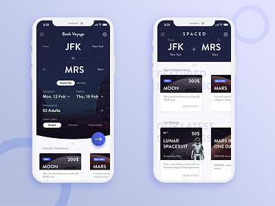
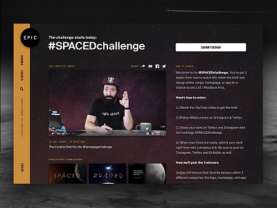
App UI for Spaced Challenge
So I finally found the courage to give this amazing contest a shot. There are so many great designs out there, it's already an honour to be a part of it.
Now let's talk about my shot-
I wanted the visual style to be elegant but not have a "startupy"(I don't know if this is a word :P ) feel to it. Also, the primary objective of the app, booking experience should be of utmost importance. Hence the main focus is given to that. Next, other features and packages, event updates etc can be accessed by swiping up the first screen revealing the second screen. I wish I had more time to animate the interactions. Nonetheless, I might post a detailed case-study later. But for now, Cheers everyone! Make sure to leave any kind of comment you guys wish, positive or negative I would love to hear! :D

