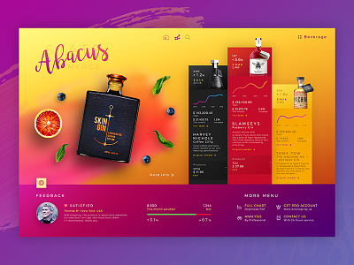
Abacus l Dashboard
Last year I did focus on the vivid element and brush on the white background. So here's something I really want to practice, it's color combination skill.
There are few designers who lead this style for me like Mike l Creative Mints, Tubik team ... They are truly hero to inspire me to improve this skill.
So I think about how to make No white design ( except font ). And what kind of UI should I do? So I picked the page that should be clean like Dashboard. This work it's statistic info for Liquor vendor.
It's really fun to do this, I have to improve it more and it is the thing that I want to keep focusing on this year.
Credit for the hero I mentioned before, and the brand of this liquor that show up the nice design of packaging.
Hope you like
Any suggestion, don't hesitate to let me know

