🌎#SpacedChallenge No. 2
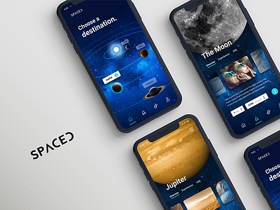
Here's my second entry for Dann Petty's Spaced Challenge🌌! This was such a fun contest- if you haven't already entered there's one more day to do so. My first entry was for the homepage, and this one is mobile.
The destination page was really important to me for users to be able to interact with the solar system easily, by pinching and zooming and panning around. Simply tap a planet, more info is shown, then start the booking process! I only built out the Moon and Jupiter, but the rest of the planet screens would follow the same layout.
The mood that I wanted to convey was awe of the scale of the universe. I got my inspiration from this youtube video about just how small we are compared to the rest of the solar system: https://www.youtube.com/watch?v=jfSNxVqprvM&feature=youtu.be. Throughout the screens I stuck with the galaxy background to give a sense that you're still in the same app, but exploring neighboring planets. The bright blue highlight serves as a playful, modern accent color.
Hope you like it! ✨🔭
Check out what I'm posting on my other socials:
Youtube: https://www.youtube.com/channel/UCAncP7gtfX40MQGLYHEhpkg
Twitter: https://twitter.com/andreahock0
Instagram: https://www.instagram.com/andrea.hock/
Behance: https://www.behance.net/AndreaHock
Medium: https://medium.com/@andreahock0


