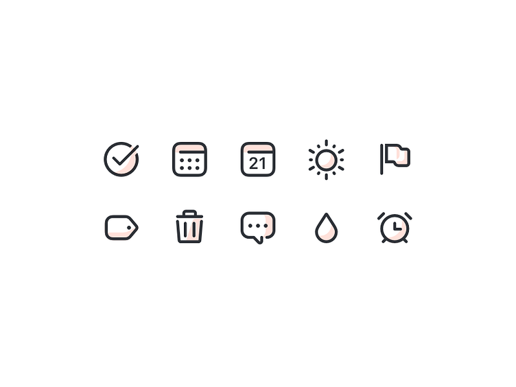
Todoist icon style exploration
For Todoist I've been exploring multiple directions for our iconography. For this one I wanted to try to be bold but friendly with subtle color tints to give a little depth and have a design element that unifies the set.
More by Alex Muench View profile
Like
