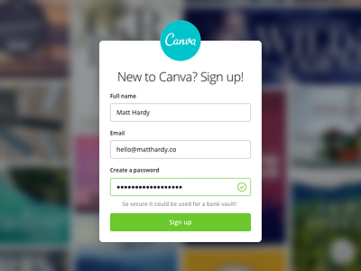
Password Strength on Sign Up Form
One of the first projects I worked on at Canva was our password strength indicator on our sign up page.
The goal was to help our users create more secure passwords and educate them in the process. We also saw it as a chance to inject Canva’s playful personality with some of the messages we display. I'd love to revisit it soon and come up with some new ones.
If you’re designing a sign up form I recommend reading Patronizing Passwords by Joel Califa. It was a huge help during this project.
More by Matt Hardy View profile
Like


