Is this the future of the space aviation?


HD Video Version Click here
Invision Full Prototype Click here
I couldn't resist joining the #SPACEDchallenge by @Dann Petty and Epicurrence.
Getting the chance to work on a project beyond the usual is such an exciting feeling. Especially when the brief contains words such as "space," "travel," "moon." Something that might sound like an SCI-FI scenario currently but the moment that aviation agencies will offer real space exploration trips to potential customers (future space passengers) might come. So here we are with a "WHAT IF" product, the www.SpacedAviation.com
Background:
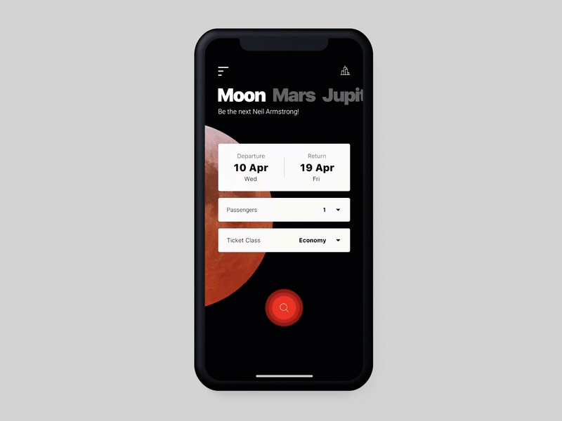
As the teasing shots partially reveal, I worked on building the logo, the homepage, and, of course, the app based on an iPhone-X approach.
I was looking to create a transparent, effortless, but yet enthusiastic booking process while I was trying at the same time to make sure that there is also a sensible dose of the product's concept itself, which is, of course, the longing of space travel. To do so, I used a dark color as my base in combination with realistic image sets of the destinations only as I had to make sure that it won't be an overdoing.
Against to the psychology of "safe" and "trustworthy," feeling that you can often get of kinda blue shades, I have used a light red as my primary brand color. Not only for contrast purposes but because I was strangling to find an excellent way to boost the company's image with a leading color that can consider as pioneering, confident, and influential.
Based on my vision, the logo had to be clean, with minimal elements that frame the concept via an abstracted but at the same time an accurate and compelling way. I used a circle shape. A great pattern with countless definitions such as infinity, completion, perfection, and more, but among others, life on earth.
The small circle, dressed on the brand’s primary color, represents the earth and the orbit of her’s within the solar system, presented by another most prominent ring that contains the brands' wordmark right in the center.
I have kept the bigger circle open to represent the infinite depth of the space while the wordmark completes the equation. Another more abstracted point of view is that it also impersonates the letter “U,” as You in the Space. Something that we can also observe in the last letter of the wordmark.
Project Overview:
Deliveries: Logo, Homepage, iOS APP
Technologies: Sketch, Invision, Adobe Premiere, Launchpad.
---
Thank you for Watching!
If you like the related shot, press "L".