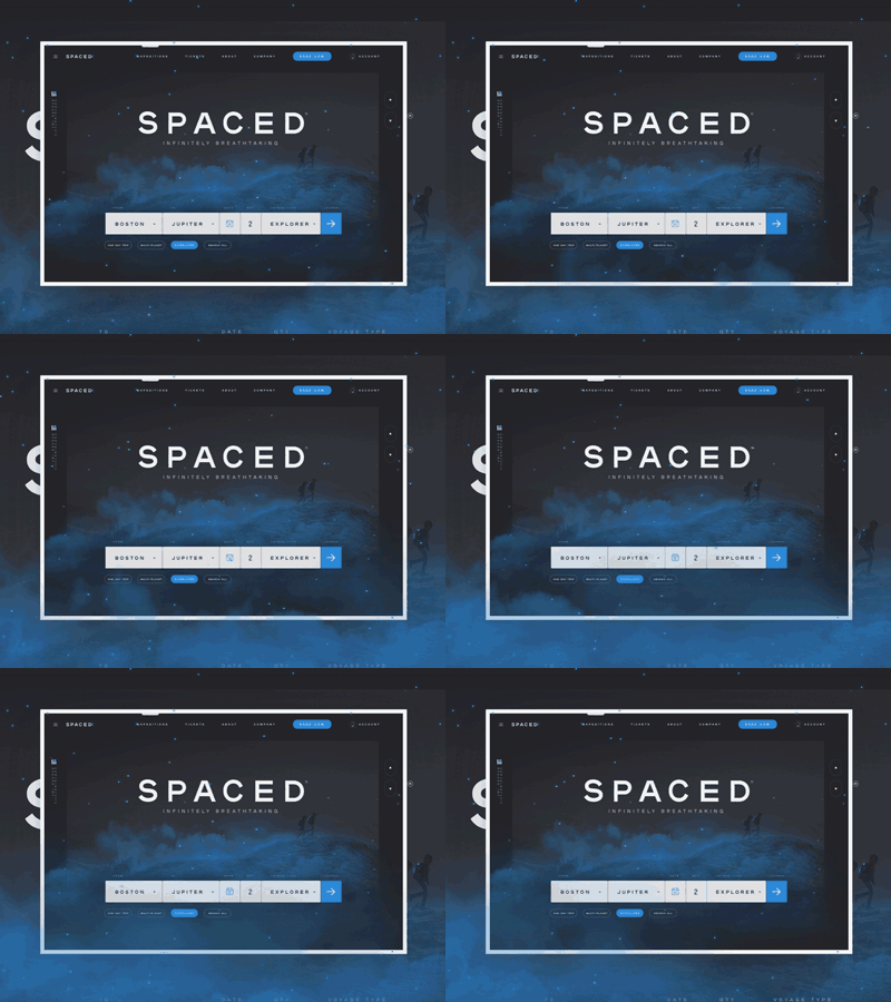
S P A C E D H O M E P A G E
2X **FULL DESIGN ATTACHED**
My submission to the SPACED Challenge. Check out the full design attached or keep reading for an overview of my approach. There was a lot of time photoshopping and rendering assets for this project (Shout out to my industrial design peeps at Altitude for the keyshot help). Thank you to @Dann Petty for hosting this and the panel for taking time to sift through all the work.
—————————————————————————
Overview of Process and Approach:
Moodboard https://projects.invisionapp.com/boards/KG3ILXDPTFX/
Insight:
Space. Machines. People. There is no hiding the industrial nature of this service. Let's embrace it instead. Brands like Tesla, Nike, Space X, Apple, & Audi pull on human emotions with sensory experiences. They give you just the right amount of "real-ness" to spark your imagination and contrast it with beautiful industrial imagery. What would it feel like to hold that in my hand? What if I was there? What if that was me? They use technology, material, and an industrial tone of voice to elevate those moments of "human" to a more special, focused instance. This is something SPACED should build its visual design around. Let’s encourage people to explore through moments of inspiration.
––––––––
Structure:
The homepage is split into 5 sections.
As the user scrolls, it mimics a launch countdown 5,4,3,2,1,0!
-Hero – CTA + Feature destination
-5 Expeditions / Activities (what to do)
-4 Destinations (where to do it)
-3 Up-selling Packages (ways to get there)
-2 Launchpad locations (where to leave from)
-1 Safety clause (I haven’t heard of this company, are they legit?)
-0 Last CTA before a user bounces
––––––––
CTA:
Motivating people to click that “ticket” button is the highest level goal for the site. There are 14 Links directing people to the ticket page and the necessary links to information for users who aren’t ready to bite the bullet.
––––––––
Photography:
The least safe thing one could imagine is floating in space alone. All photos of people show experiences on the ground, or with other people.
Indoors = Industrial paradise, high tech, monumental destinations, stunning design.
Outdoors= real, breathtaking, natural. Awe-inspiring landscapes. A place for you to explore.
––––––––
Safety: This is more of a “show me don’t tell me” aspect of the brand. This website builds trust through content and tone of voice. Lots of considered content starts getting to a “large legit company” feeling (This isn’t a startup testing out their new ships). It’s approachable but has the necessary maturity to start building that trust and peaking interest the second the page is loaded.
––––––––
Color:
Color is functional for SPACED. A moment of attraction, a call to action. Blue is the color of our launch button and the glow of our ships’. Blue is approachable, soft, and trustworthy. To build in the “space vibe” it was important to keep the background dark. Overlaying the dark background with a warmer color amped up the energy a bit too much and started feeling a little “imperial”. Blue allows SPACED to be approachable in a sophisticated way.
——————————
If I were to keep working on this I would focus a lot more on the app. I think there is potential for a mobile app to help curate experiences other than ticketing for customers. Ideas like way-finding, keycard / lodging controls, vehicle access, jetpack controls, restaurant ordering, and other experience driven ideas is where I would start exploring from. Next step. Building this in @Webflow !
Thanks for hosting this. Hope you host more in the future.


