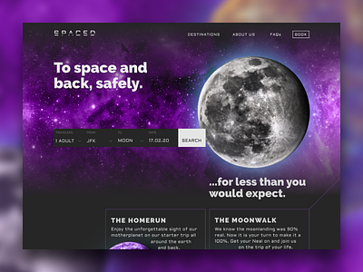
SPACED - Challenge
@Dann Petty came up with this fun idea of a contest! Really had a blast with this and it was so much fun. I did the whole thing with @Figma to get to know the tool better & it felt really good. I also made a prototype with @Atomic in which I was mocking a kind of hyper space animation when you are changing the destination. I'll post it when I have found a better way to screencapture this then using my iphone.
As far as this design goes it is kind of funny how I started with a classic Nike Airmax color palette (mostly white and orange & only a bit of black) to this but I am actually quite happy with it. (Nike also uses purple, right?)
Additionally I wanted to use another grid than usually since I am currently experimenting with CSS Grid Layout as well. So this was based on a 5 column grid to make the whole thing even more challenging.
Cheers!

