REI Logo Rebrand
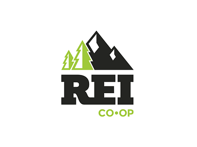
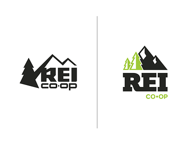
My version of how an update to the REI logo could look. Keeping brand elements such as trees and mountain, the bold text and the smaller sub text - as well as bring some color into the mix.
More by Toby Riley View profile
Like


