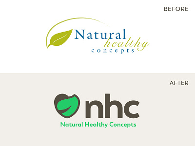
NHC Rebrand
Our team is excited to be wrapping up work on the rebrand for our Natural Healthy Concepts store. This one has been a long time coming and we were thrilled to get the green light to take a crack at it. We think we nailed it and so far our customers agree. Wide release set for Summer of 2018, progress on the brand system and new e-commerce storefront in the works!
Symbolism:
* Heart - "health" but also our care and compassion for the customer. We don't exist to push pills but to renew lives.
* Leaf - modeled after the bay and dogwood leaves which symbolize healing, care, faith, hope, rebirth.
* Path - the midrib of the leaf is reminiscent of a path to signify the journey towards health we're all on and that we exist to support you on your journey toward greater health.
Creative Direction & Strategy: Jonathan Zajas
Lead Designer: Matt Frey
Props to all the Renew Co. team members involved.


