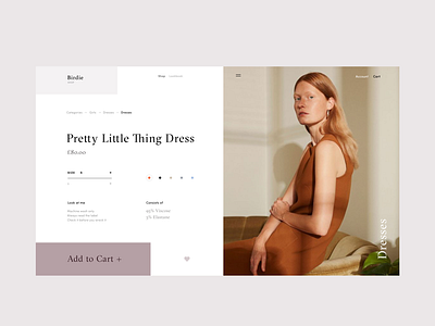
Birdie Store Product Page
Hello friends,
This is the animated version of the Sunglasses product details page for the fashion e-commerce store called Birdie. On this page, visitors can choose quantity, color as well as better familiarize themselves about the product. The key focus is of course on the CTA, which is both prominent and appealing.
My general objective with the design was to play with the geometry of layout and whitespace.
I think it came out pretty neat and stylish. Eager to hear your opinion on this one.
Have a great weekend :) Cheers!
Press "L" to appreciate it
More by Synchronized View profile
Like

