SPACEDchallenge Homepage


Hey guys,
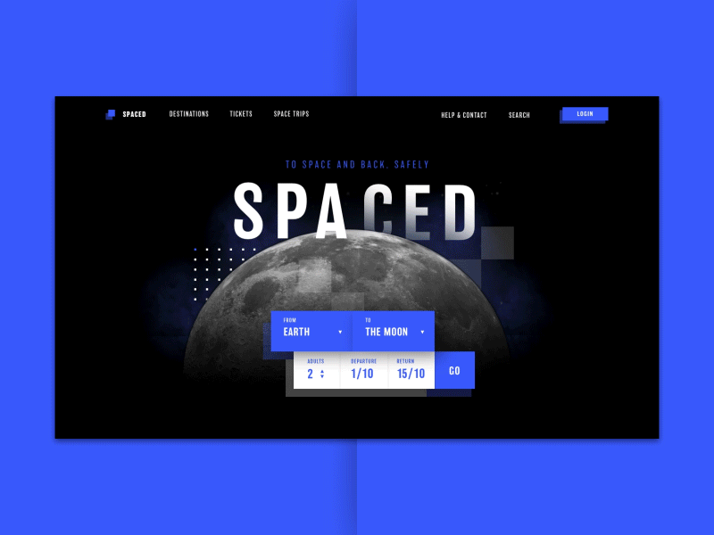
Here is my final design for the #SPACEDchallenge. This design probably won't win the price for best conversion, but I really tried to push the visual style to the next level by implementing and combining styles I never tried before. My biggest inspiration came from interfaces implemented in Virtual Reality.
Those interfaces really gave a futuristic feeling. One thing I saw coming back in all those interfaces was a sense of depth. With the help of shadows, images of galaxies, neon looking lights, animation and layering elements on top of each other I really tried put the sense of depth back in the homepage.
The homepage needed to inform potential customers about the safe travel experience to space. The blue color is in my opinion communicating both the safe/professional side of SPACED, as the futuristic side. The all caps titles & solid forms are giving the composition a trustworthy & high end feeling.
I really enjoyed designing something futuristic that forced me to step a little bit out of my comfort zone.
If you've never heard of the #SPACEDchallenge, @Dann Petty is giving away three MacBooks for the best logo, homepage & app design for a space travel company called SPACED. You still have two days left to come up with something cool.
So that's it guys,
Have a great day.