○ Phase Logo
Hey dribbblers 👋
Today showing you — I think — my most important project so far — the logomark for Phase.com.
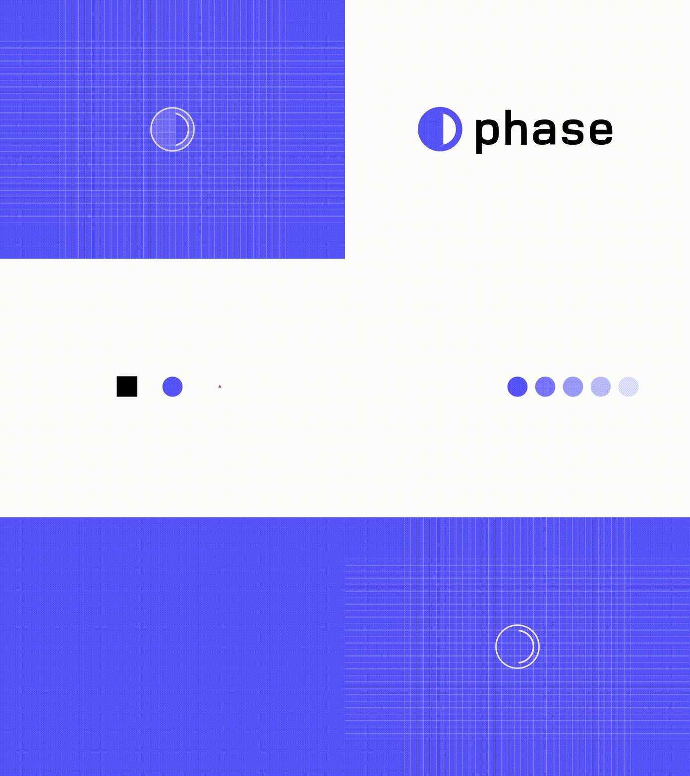
The final form is a sum of motion, components and product phases — the key values the new tool brings to us, product designers. This animated .gif is my visual explanation of the idea behind the form. After experimenting with tens of different forms, we finally agreed to stick to the most simple, iconic and remarkable symbol. I hope it's going to stay with Phase for years from now.
Phase.com. is new interaction tool for designers. It's a creative tool for screen design with focus on interactivity, responsiveness and collaborative workflow and the idea behind this software is something I'm especially excited about. You should definitely check it out. Happy to work with this awesome team <3.
Stay tuned, if you want to find out more about the design process behind it! ✌️
