unorthodox fin-tech signup flow

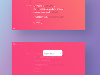
What you’re looking at is the signup process for a fin-tech robo advisor. The goal was to make the product so friendly, that it could easily replace a professional financial advisor. For that reason, instead of a bunch of good ol’ input fields, we went with an in-line, context based form. That’s so much less overwhelming for users, and dare I say - maybe even a bit fun to fill out? :)
In any case, expect to see more tomorow!
Creative direction by HOO KOO E KOO! (http://hookooekoo.co).