School of Accountancy Preliminary Studies
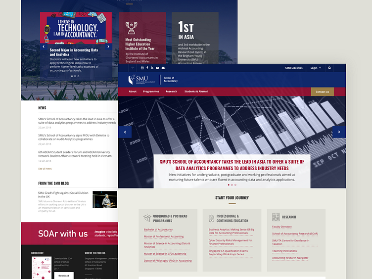
Here's one of my first studies for the upcoming redesign of SMU's School of Accountancy (https://accountancy.smu.edu.sg/). This will be the first school to adapt the new SMU template that we launched last month.
A few things about this homepage: We're currently experimenting on different imagery that will suit the hero banner, as well as ways to display the 'Start your journey' links so that it would not be too overwhelming. SOA is still a bit manageable because they have a small number of links, but this solution, though easier for the user (just one click to the programme), is not ideal for other schools with almost 20 programmes.
There are a few more tweaks to the 'at a glance' and the CTA at the bottom, which can accommodate a Giving campaign.
What can I do to improve a display of a long list of links? Should I use an accordion? dropdown? Suggestions are welcome!
