Rebound
Looks cool.
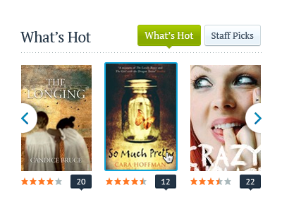
Maybe make the white semi-circles a bit bigger to give the arrows more room to breathe. The little zoom icons are so small and maybe unnecessary as people are so used to clicking on book covers online to get more information. Keep it as a simple 2 px vertical shift and blue border?