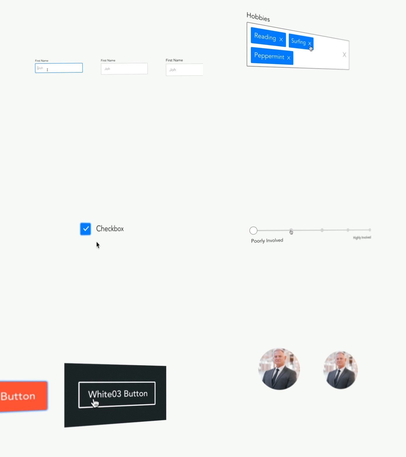
CollegeVine's UI Style Guide
The main goal of this project was to create a unified design language across all our products.
A few things to note about the elements in the style guide: - Elements are designed to be usable on different screen sizes (mobile, tablets and desktop). - Each element was designed to give enough contrast between the background and the text. - Color-blind friendly. - Each element has 3 different sizes.
After designing most of these elements I worked closely with our front-end developers to have our own library of React components which we now use everywhere in our products.
This is an ongoing project which the team will work on improving continuously, and our next big step is to design a pattern library which would help us even more as we build websites in a shorter time while maintaining the same quality, look and feel.
