Video Music
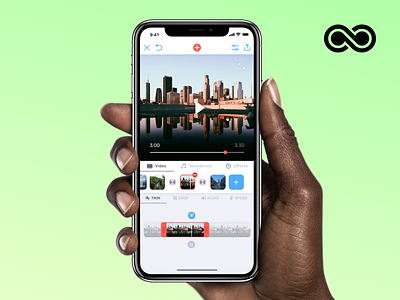
Here's one of the most challenging UX and UI jobs I had. Designing a video editor requires loads of fore-thinking and back and forth between design & prototyping. Indeed working on the UX and UI of Video Music required creating a high-fidelity prototype in Origami to inform UI decisions and make the UX as smooth and user-friendly as possible.
We also went for a "tabbed" interface this time to make every section and lots of tools easily reachable. The interface is fully responsive and flexible so it adapts to every video aspect ratio and also different display sizes.
What do you think about this design?
PS: If you like the idea of working dynamically at designs and prototypes, iterating with a diverse team of app makes, consider applying for the UI Designer position at @Bending Spoons ✨


