Lit Fire & Security Logo Concept
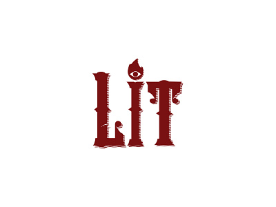


Lit Fire & Security. Concept by Anchorpoint. This is one of my favourite explorations. I went with a custom designed typeface taking inspiration from the vintage fonts of the 1920s. We wanted to give the company a hip, vintage feel that would set it apart from the typical fire alarm and home security vibe that most companies have, while at the same time maintaining an impression of authority and professionalism. The flaming eye is the tittle (man I love that word!) on the 'I' in the type, but can also be used on its own as the icon.