SPACED CHALLENGE - Homepage Contest Entry

Decided to join the #SPACEDCHALLENGE. Really fun brief & project, kudos to @Dann Petty and everyone that's involved in it.
Some explanation points:
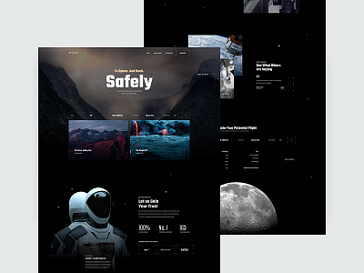
Section 1:
Big ass hero with quick search for dates & featured/new locations. Hero image could be changed with other locations(as shown in the right slider). Wanted to show the word Safely as its the main keyword in my concept.
Section 2:
I tried to gain the user trust with the second section of the concept. I wanted to bring credibility to the service by showing useful stats, big brands that are in the project and more. To make everything ‘up-to-date’ decided to make the suits image interactive. That will give even more details to the users & will hopefully gain/solidify their trust.
Section 3:
The 'what we offer' section where we show different perks of booking with the company. As shown in the example we have Hotel Booking & Accommodation + real world images to solidify that. Here we can also add cool spots to visit, check-ins & more.
Section 4:
Not sure yet? See what others are thinking. With the testimonials I wanted to bring the human element back in the design. Why? Because everything became to sci-fi and seeing real cases would make the word Safely pop out in your mind instantly.
Section 5:
Footer / Evaluate your flight here, just a quick shortcut for the booking mechanism instead of scrolling up you can immediately do your thing.
I think it could be animated really nicely but had no time for that unfortunately(had to tackle real projects).
What do you think?