#SPACED Challange


I decided to enter the amazing #SPACEDchallenge and submit my entry.
@epicurrence @Dann Petty
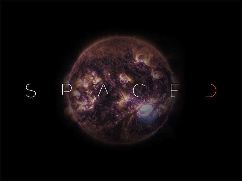
I decided to create a futuristic logo and brand, one that could be easily adaptable across a multitude of platforms. The brand is clean, striking and powerful.
The logo represents the sharp and bright future of Space Travel. Subtle suggestive strikes on the lettering give balance to the logo.
I wanted the logo to be modular for use across promotional, branding and digital areas. The colour palette is subtle, yet the hint of red shows 'SPACED' is alive and ready. The type is clean and crisp and straight to the point.