Spaced Challenge
Here's my submission for Dann Petty's#SPACEDChallenge logo design competition.
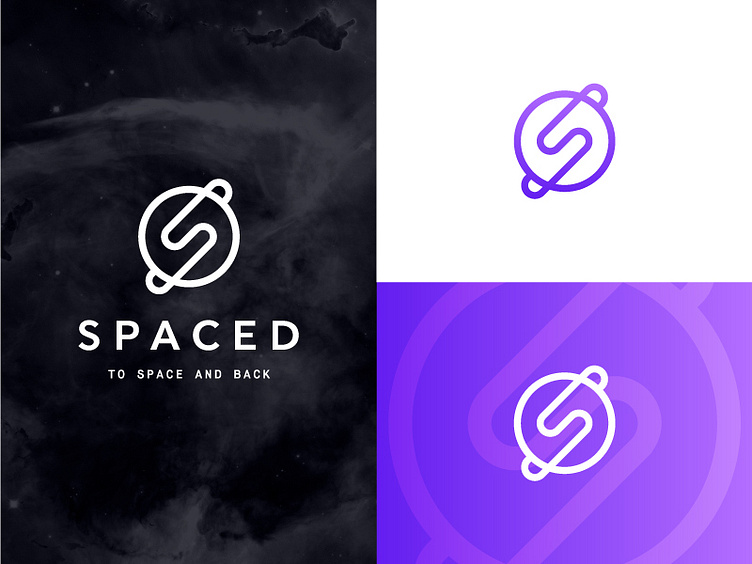
Inspiration: I've always loved the NASA worm logo. The "S" planet mark is based off the letter construction of NASA's original logo. The "S" wraps around the planet alluding to planetary rings.
Colors are black, white and two shades of purple. The purple was chosen from a deep space study visual that NASA posted to their Flickr. Hope you dig it!