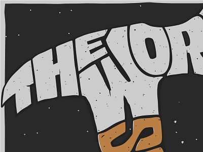
The Work So Far Graphic
This is a graphic I'm working on for a design realign of my personal site. I'm using this–I think–on the home page. The layout on the site will be slightly different to account for a paragraph or two of text. So far I've been layout it out on the right side under the "O-R-K". I'm going to attempt to use CSS shape-outside to flow the text along the path of the type/hammer.
My goal with this graphic was to get that screen-printed look. To do that I spent I long time making sure every color was separated. In my mind this is a 3-color print on grey paper. The colors would be 1) dark grey 2) darker grey (the outline of the type shape) 3) the brown of the handle "so far".
The texture on the letters took me a while to figure out. I kept looking for some type of brush or pattern shortcut to make it faster, but couldn't figure it out and realized there was no shortcut. Each dot of the texture I did by hand. Just make a shape, copy/paste, move, scale/rotate, repeat.
Because I'll be using this as SVG on my site, I also wanted the graphic to be the most simple representation as possible. That means so clip paths or transform, just shapes. When this is exported and optimized as SVG it's only three paths and around 35k.
This was tedious, but a lot of fun to see the results. I'd like to do more of this illustrated type in the future and maybe screen print some of them.


