youbringfire_08
Alright, just one more to share after this guy here.
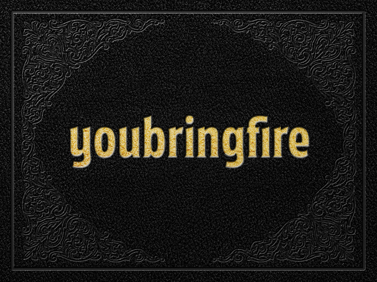
This particular logotype was based off the same typeface I drew for @Scinston & Wott although some modifications were needed. To get it to read better at smaller scales, the counterforms were opened up by making the letterforms wider as well as increasing ascender height and descender length. Lastly, the overall spacing was opened up to match the newly widened forms.
This guy and many more are currently living on my new portfolio site –– http://youbringfire.com
More by Scott Biersack View profile
Like

