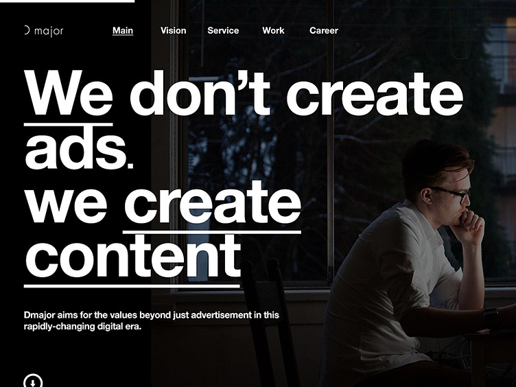
프로젝트 편집 d major responsive website
https://www.behance.net/gallery/10256011/d-major-responsive-website
designideas.pics interview
https://www.designideas.pics/d-major-website-by-bory-kim/
My initial goal was to design the most optimized version for both PC and Mobile platform by eliminating unnecessary decorative stuffs. There are 5 rectangles on the sub-page and each of them indicates a corresponding menu with perfectly optimized for Mobile environment. To maximize the intuitiveness and the focus of the audience, there will be simple text and sub-menu in every rectangle and added “+ button” to expand the whole description. -Bory Kim
More by bory kim View profile
Like
