Forward Ed Icon Set
Onward!
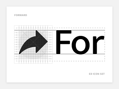
We'll soon have consistent, platform-wide iconography built from a grid that aligns with our font metrics. The baseline, caps-height, ascenders and descenders inform the glyph construction. The softened, rounded corners have a place in the design, too.
I've avoided optimising too much for readability—the icons always display alongside text and are used in our design language more as waypoints once users know what they're doing. I also wanted the icons to be flexible for use as design motifs at larger sizes.
