Artqui mark
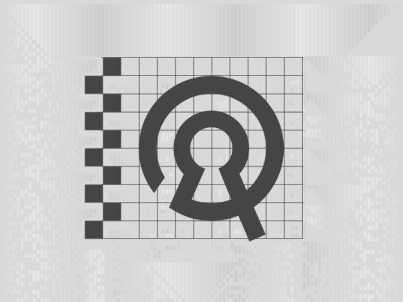
A logo design project from 2016. It was for an Artqui, an online art store based in Germany, works mostly with young contemporary artists. The main concept was around the French word Qui, which can be translated as “who” or “that”. Depicting a keyhole, a question mark, a labyrinth in a shape of a letter Q. The secondary association can remind of an at sign (@) or wifi symbol, which refer to the online business.