Challenge Core App


Guys, here's the shot #2 from my latest project Challenge Core
Let's get into more details.
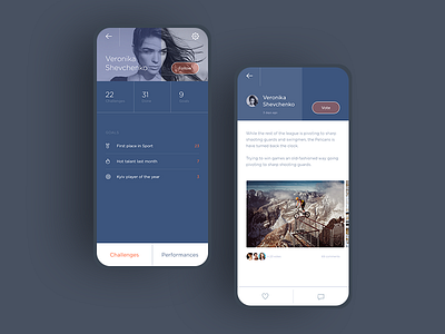
First screen is User Profile:
• dark blue background color makes the composition exquisite and complete, there is no need to add more content to fill the void.
• orange translucent Follow button is clearly visible but doesn't look heavy.
• profile photo is quite large so you can look into brave eyes of the challenger.
Second screen is Implementation Report:
• white background has been chosen to improve content readability.
• horizontal scroll allows to view beautiful pictures without unnecessary tapping.
• minimalistic icons at the bottom of the screen don't take up a lot of space, nevertheless, the challenger can monitor his likes and comments easily.
Why did I choose the blue color scheme? I associate blue with calmness, confidence, and creativity and I do believe that the blue palette suits this project to a tee.
Here are 8 more screens, don't forget to check them out.
One more great shot is coming, so stay with me!