S P A C E D
Hey everyone!
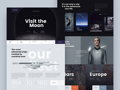
This is my entry for @Dann Petty 's S P A C E D challenge, when I saw Dan’s video I was captivated by the idea, and I started thinking how to do it, how could be the trip, the spaceship, what people can do on the moon etc. And if you check out my Dribbble profile you can see that I’m interested in things about the space. so I knew I had to make a design.
I wanted to stay away from the dark/astronaut theme, and show a more futuristic and safe approach, the best example that comes to my mind is less like Gravity/Nasa and more futuristic like Passengers/Star wars/wall-e
This is the page that sells you the moon trip. I decided to make this page because it let me take the idea further.
The "book now" form sticks to the bottom of the screen to be always present. I imagine there is a landing page for each destination, each one with its own color scheme, and also a page to book the flights and another more corporative one with blog, jobs etc.
I hope you like it! and don't forget to check out the full-size attachment
🖖

