SPACED mobile app
Had fun working on this for the #SPACEDChallenge put on by @Dann Petty
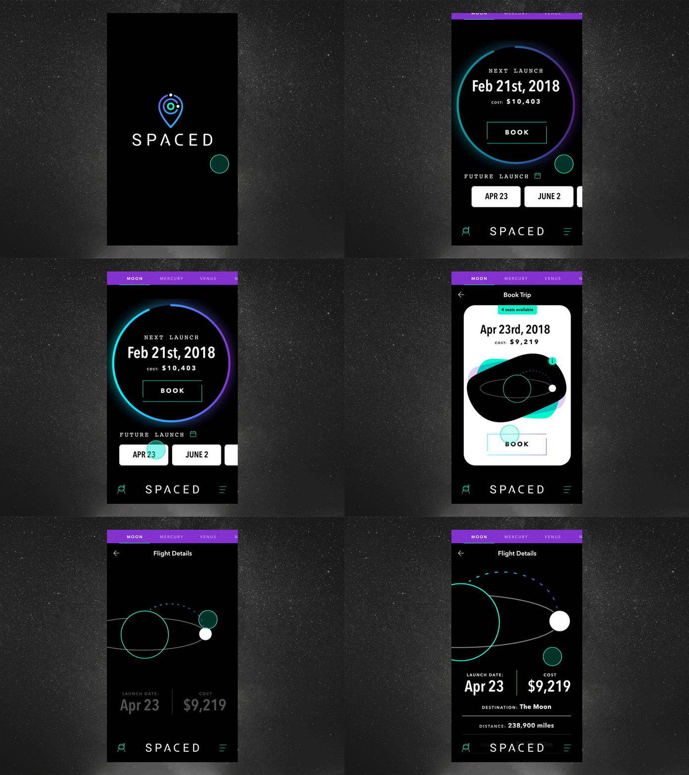
Userflow/Screens shown:
-Simple loading screen
- User gets to the main screen and can either book a seat on the next launch date or select a future date. The thought here is the circle would be a countdown loader to launch.
- User looks for more info for a launch on April 23rd where they can see duration, mileage, a map, etc.
- User decides to learn about the flight details before booking.
Zoom for details.
More by Justin Harrell View profile
Like

