SPACED Booking
'Sup guys
Spend some more time on finalising my concept for the #SPACEDchallenge @Dann Petty is hosting.
There's still time to join in! (and win a macbook pro 🤯)
https://www.youtube.com/watch?v=V0RS1znr7RQ&t=252s
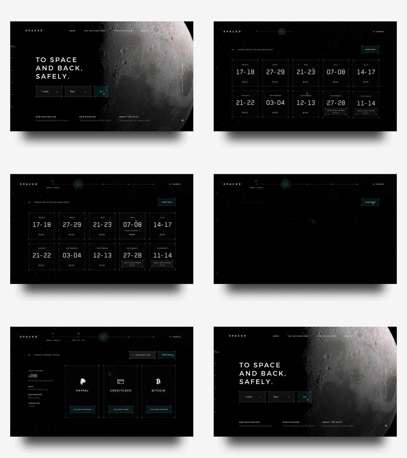
Added a more prominent booking UI on the homepage (above the fold). I did 2 fields, how many people and the destination. The idea was to not have like 5 fields on the homepage to get people faster in a booking flow, more people in a bookingflow equals more possible sales. I did 2 steps of the flow, the date choosing and the payment. Learned a ton while doing this concept and had a great time.
The idea behin the dates is that SPACED sets specific periods for spacetravel which you can choose from. That's why there's no datepicker with months. If you choose to plan ahead and book some travel that's far in the future you can also enjoy a early bird promo.
Had an awesome time working on this sci-fi kind of style UI.
Made this with good old photoshop and principle.
In the attachment you'll find the screen designs, a longer video of the booking flow. You can download my principle file of the animation here. Just want to give back to the community. Hope you guys can find some value in it.
Let me know what you think!
Have a great week guys! Peace ✌️


