Pão Real: Rebranding
Hello Dribbblers!
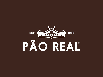
Today I want to show you the logo I developed for my rebranding project for the portuguese artesanal bakery from Mafra Pani-Mafra for their main product Pão Real bread line. "Pão Real" translates from portuguese as ""Real Bread and also "Royal Bread". It has a double meaning.
The main goal was to improve brand image and give their profile design a proper structure. Pani-Mafra was looking for a fresh direction that would position it at the forefront of consumers' minds with their product Pão Real.
Their old design profile was unstructured and lacked the visual appeal, which they are aware of. Pani-Mafra also sells Pão de Forma Saloia with a completely different design profile, absolutely unrelated to Pão Real. Confused? Yes, I was too and so was their audience. I decided to give their profile design a proper structure and remove the confusion of using two different identities.
I developed an identity that would pay homage to the brand’s heritage and would be relevant to today’s consumers. The driving idea behind the rebrand was to bring emphasis to artesanal and natural way of making bread. Whilst the previous design had the Crown in a shape of the iconic Mafra Palace, the image was outdated and new direction was needed. I kept the crown as a central part of the design, but gave it a fresh look. The new look highlights the brand’s unique "Mafra" values of strength, honesty and hard work expressed in a modern way. Drawing its cues from mafra bread itself - the resulting aesthetic is very balanced, warm and traditional – an approach that is true to the brand's icons and history. As part of the re-launch, new labels, packaging and a website were developed.
The creative process was divided into several steps, each requiring critical solutions. You can check some of the other logo concepts for the rebrand in attachments. The colour palette as well as the typeface were selected based on both market category and product research.
The idea was to keep it simple, clean and elegant. By using minimum number of colors and by creating a monogram logo to give the identity a modern and elegant look.
