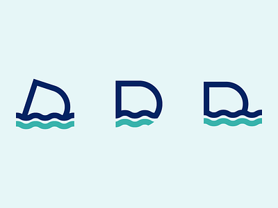
Dive Logomark Exploration
Unused D + waves logomark from a diving school related project.
I love the simplicity of these marks with the mark on the left being my favourite. I feel the slight tilt of the letter D gives it character as well as symbolising the diving aspect.
________________________________________________
More by Nick Budrewicz View profile
Like
