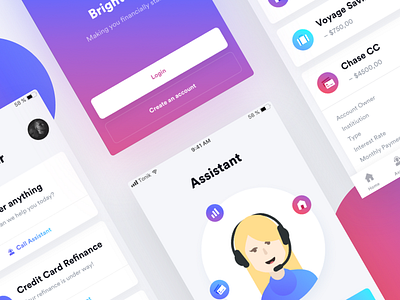
Financial Assistant part III 💸
And on the third day, I rose again 👼🏼
Before we kick off the weekend, please feel free to lay your eyes on some moving pixels from the app I showcased for the past two days.
It basically explains my idea on what the users see while opening the app. Tried to make it look fancy, but not overwhelm the audience with lengthy, „dribbble-oriented” interactions (one of the few insights I took from @Michał and @Martyna talk on Micro UX earlier this week).
Constructive feedback appreciated. Have a great weekend! 👨🏼🎨
More by tonik View profile
Like

