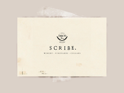
Scribe Winery - Vineyards - Cellars (Logo)
American tastemakers don’t relate well to heavy-handed visions of wealth and excess. These premium wine enthusiasts appreciate the history of wine, but they don't want to hang by a fake chalet pretending they're rich, either. They want to sit on grass and eat and drink with nature.
Much like the land and its vintner, Andrew Mariani, the Scribe branding stands out with natural effortlessness.
I went with a classic look, threw in some organic assymetry, and finished with subtly disruptive "we-know-logos-are-dumb" details (a flipped trademark insignia amidst a refined logo creates a subtle anti-corporate wink). Unusual copy and minimalist bottles further alert the consumer to Scribe’s no-nonsense, keepers-of-this-land approach.
Full project
https://www.kevinlandwehr.com/scribe-winery-branding/


