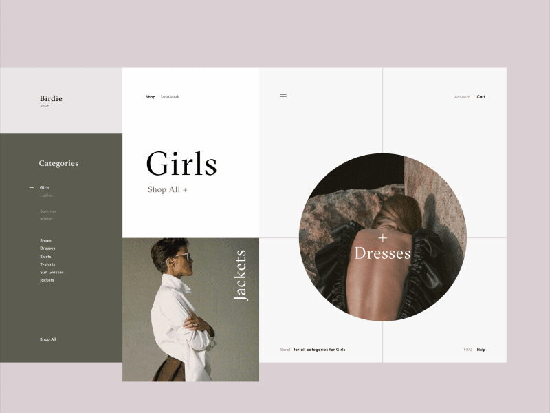
Birdie Fashion Store Categories Page Animation
Hello friends,
This is a new series of my animation explorations while working on the redesign of a fashion e-commerce store called Birdie. This time the shot showcases category page transitions. The key objective with this one was to play with the geometry of layout, unusual grid and whitespace.
Hope you like this piece of inspiration. Please share your thoughts and comments!
Remember to stay tuned for more :)
Cheers!
Press "L" to appreciate it
More by Synchronized View profile
Like


