SPACED Logo Contest
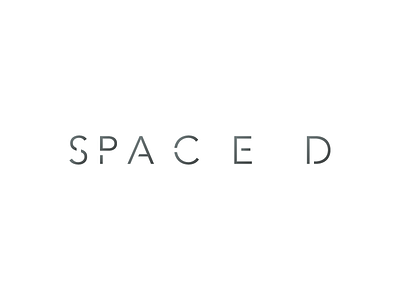
My entry for the SPACED logo contest.
The concept was to play with custom typeface's (Avenir® was the starting point) kerning ( space between characters) in order to show the letters behaving as planets.
Another thing was the space I created inside the characters taking ownership of the continuation principle from Gestalt. The gap is filled on viwers' brains and rhymes with how SPACED company filled the space travel gap.
See attachment for brand applications ;)
More by Gabriel Felix View profile
Like


