📱 Planning, Kitt : Ornikar Design System
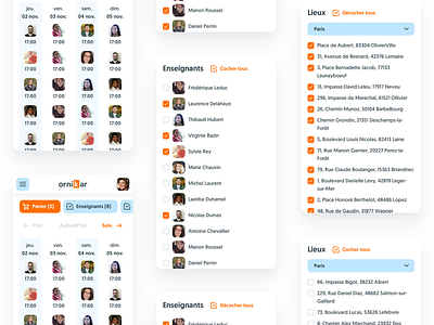

Overview of the updated Planning screens for 📱 mobile. Now that we have Kitt we're able to rapidly switch between desktop and mobile mockups while keeping everything consistent and true to Ornikar's look and feel.
There's actually very few differences between desktop and mobile components. In the first version we had a font size for the body copy of 16px on desktop and 15px on mobile devices, which meant duplicating all the components to make them fit the 2 sizes.
Though we quickly saw the benefit of having a consistent font-size for the body copy of 16px for both platforms. We were then able to kill Kitt Mobile and have only one style guide, with very few variations of components based on the device.