SPACED
Hey, everyone! It's been a while 😄
I'm excited to share my submission to @Dann Petty's #SPACEDchallenge.
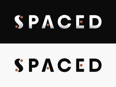
For my logo design, I wanted to play around with the company's tagline, "To space and back, safely" and create a logo mark that represents the path from one destination to another.
The result is a logo mark in the shape of an "S" (for SPACED) that shows the organic 'to and from' journey from planet to planet. This curved, looped shape also reminds me of an infinity sign. The dots in the overall logo can represent planets or moons or blackholes (?) 😱
I chose to keep my color palette simple: black, white, and one accent color. The orange color popped out to me the most when researching photos of outer space because it symbolizes energy and heat.
I've also included an illustrative logo mark which shows a glimpse of the stars in outer space within the curve of the "S". This can be used for cheeky, fun illustrations on advertising for the company.
Thanks for checking it out!
✌🏼😄


