Niketo logo treatment

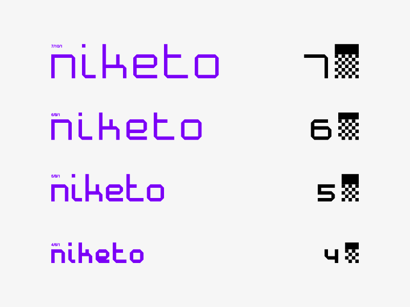
Early typeface exploration. My aim was to find the optimal grid size to build letters. So I've started at 10×10 and went down to 4×4. While big grid provides good readability, the letters look too generic and thin. Small grid helps to build more distinctive "branded" touch but result lacks readability. I think I'll stick to 6×6 grid and further images are coming soon!