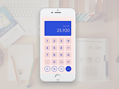
Daily UI_calculator
I chose a rather soft palette to make punching numbers more fun and friendly for users because calculating is tedious and dreary.
Other UX considerations: leveraging contrast to increase legibility. More distance between "clear" and "equal" to reduce the chance of wrong clicks. Grouping numeric and symbol input together as one group to reduce visual clutter. Giving hints of numbers and functions already input above the result to give users a hint of system status.
More by Lucia Ziyuan View profile
Like
