More Stuff
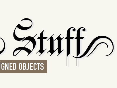
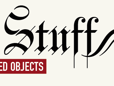
Added a shadow to try and soften the typeface a little and rounded off the box corners. I love the red and black combination on the previous version, but not sure if it dominates the masthead.
More by Leanda Ryan View profile
Like

