💎 Travel Booking - Landing Page Concept
Team: @flyin.com
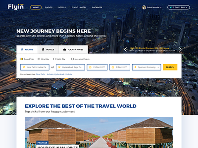
This is a concept design for improving the feel and outlook of our company's current homepage. The idea was to get the focus and emphasize more on the search modal by using white and lighter shades of grey on a dark background representing Dubai, our most sought-after destination for bookings. The ongoing offers section has been put up at the top right position over the search modal to display it as and when a booking is in process. The second fold of the web page consists of hot/trending elements from Flights, Hotels and F+H combined.
Any feedback on this would be appreciated!
Don't forget to press L/F 😊
Follow our team's work here: @flyin.com
More by flyin.com View profile
Like

