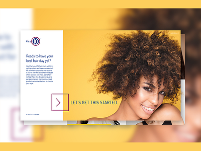
Its A 10 Website Quiz UX/UI
It’s a 10 was in the middle of re-designing their website and branding. With that, they also wanted to launch a quiz campaign to bring users to answer questions to better serve their hair needs for both women and men.
I decided to go with a cleaner and minimalist layout, and used large photography that took over the entire screen. Making this more appealing and fun at the same time. User is able to select answer by clicking on an image, rather than boring text. The goal was to make it engaging and fun!
More by Melissa C Echeverria View profile
Like
