Daily UI #002
DailyUI #002
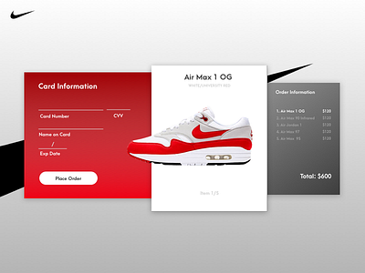
Created a credit card checkout screen for sneakers.
I took a look around Dribbble and saw a lot of great pieces for this challenge but what I noticed was that a lot of them weren't too practical for real use. A lot of designs were only checking out one product but most of the time users aren't only buying one item. I wanted to try and capture that experience by including multiple items being checked out.
Any feedback (good/bad) is appreciated.
More by Your Typical Creative View profile
Like
