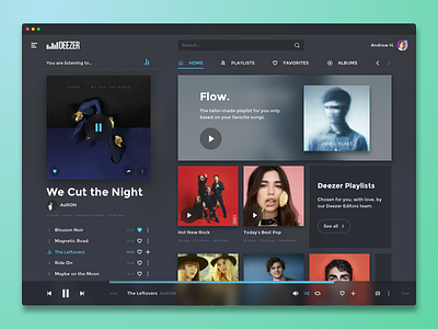
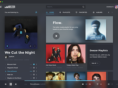
Deezer redesign (desktop app)
Hey there !
This is my first time redesigning a famous interface.
I usually do UI design for clients but I wanted to enjoy my free time with something I often use. In that case, the exercise focused on Deezer's desktop app (beta).
For those who're asking how works the navigation (in that case, I failed…), there's two scrollable areas. One on the left which shows you the current playlist, and another on the right to scroll the content linked to the tabs (as you can see, "Home", "Playlists", "Favorites"…).
If I have more time — if you like it — I'll add a few more pages and maybe make it alive with After Effects.
Feedbacks are very welcome ! :)
— Dimz
More by Dimz View profile
Like

